
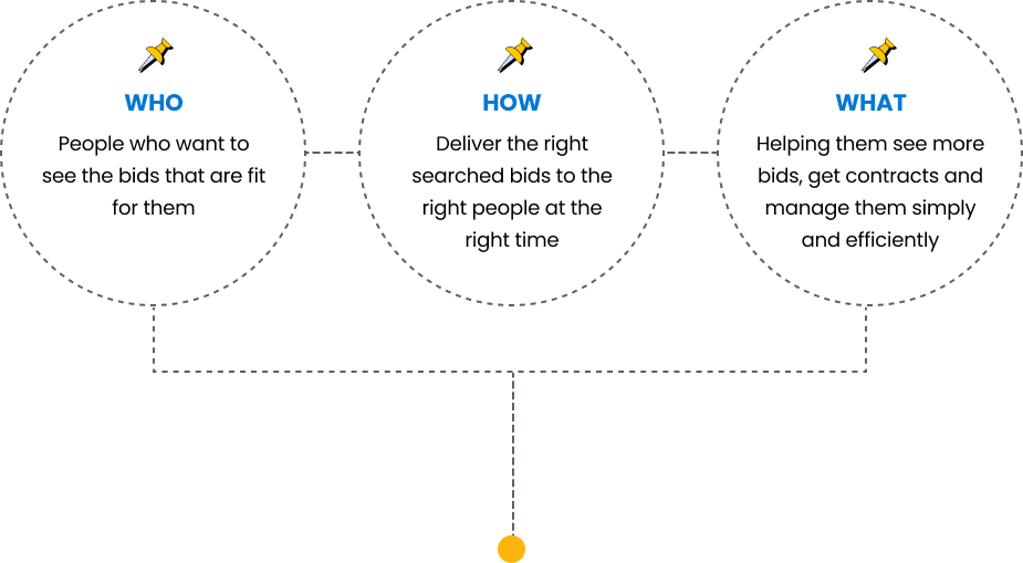
Navigate a product with ease but without any friction and reduce confusion and cognitive load to accomplish a task.
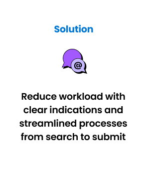
I focused on creating an intuitive and comprehensive interface. It enables the users to draw up a bid in the most seamless way possible. Also, to reduce ambiguities, I design with visual hierarchies while complying with WCAG2.2.
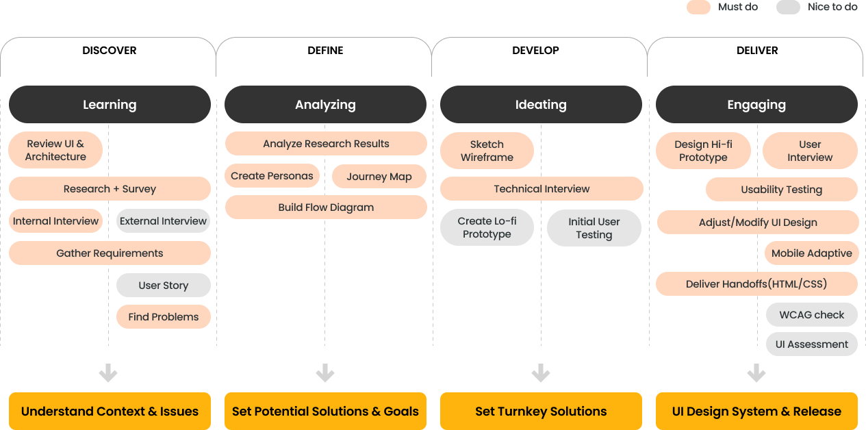


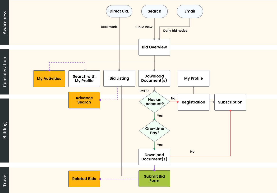
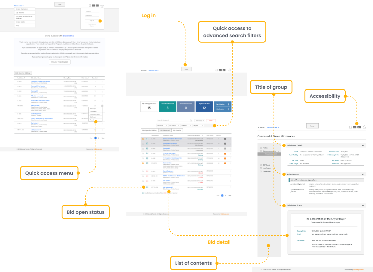


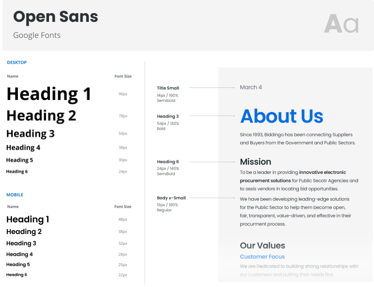
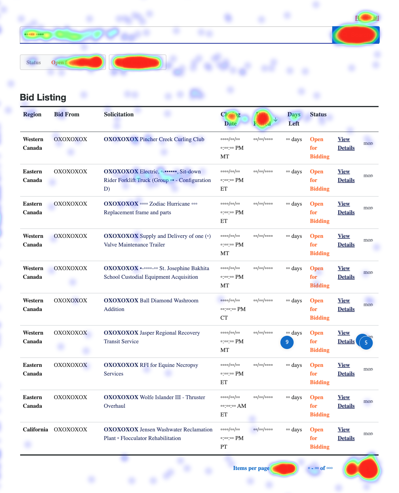
I optimized all elements and layouts for small to medium screens by applying a grid system I created and CSS work-frame.
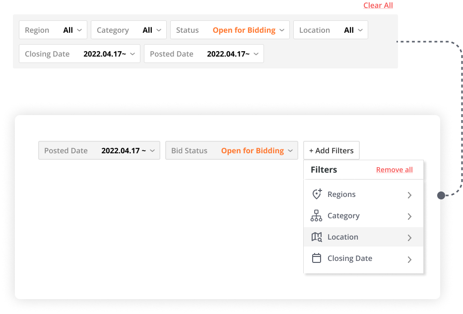
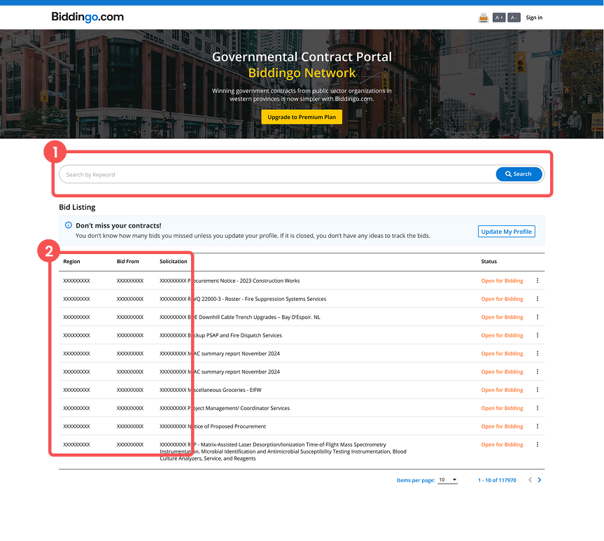
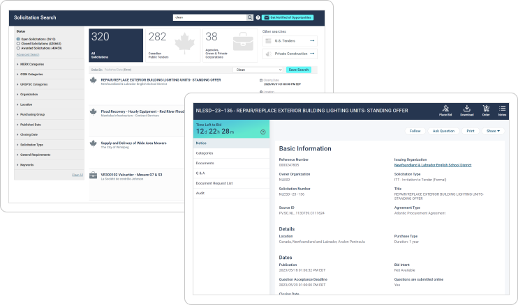
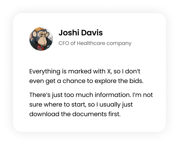
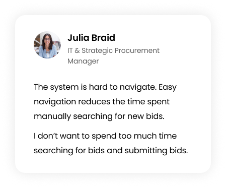
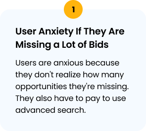
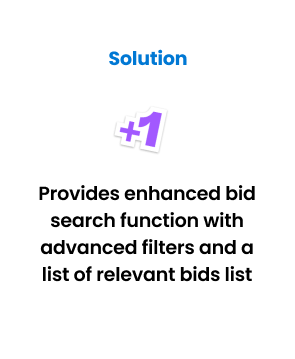
Users are blocked from exploring. Search exists, but key details are hidden and there are no filters to help them browse effectively.
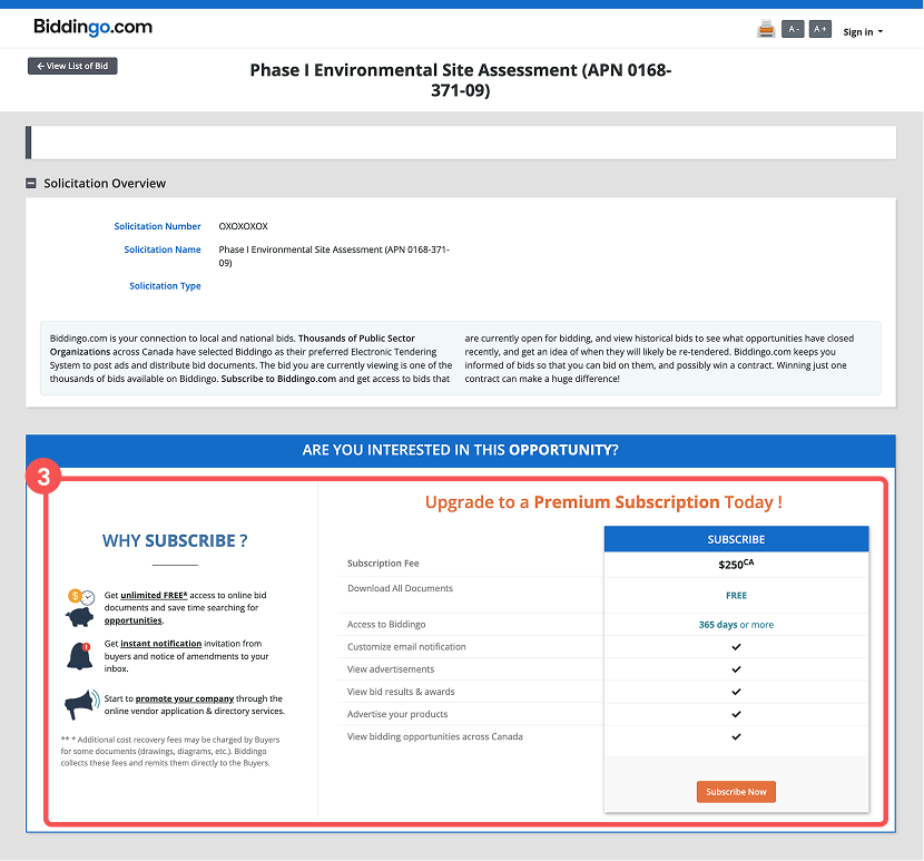
Removing the 30-day trial and offering only paid subscriptions makes the platform feel paywalled and unwelcoming. Users prefer competitor sites where they can access open bid information for free after a simple sign-up.
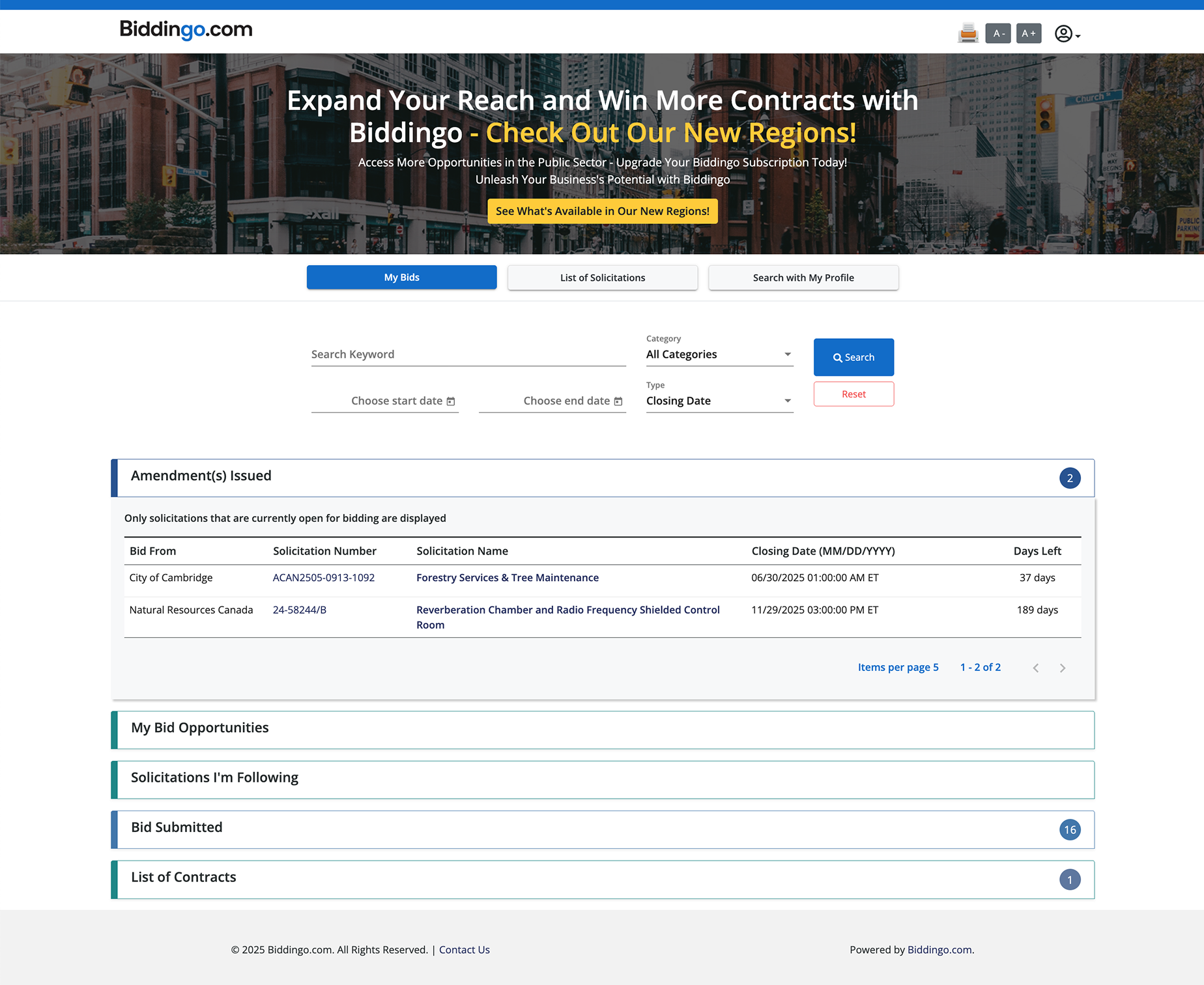
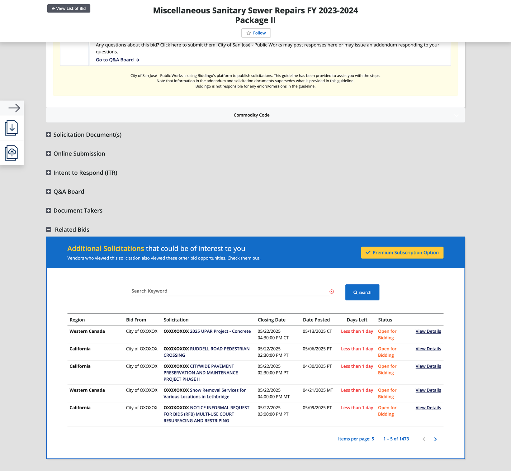
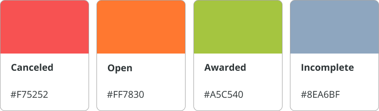
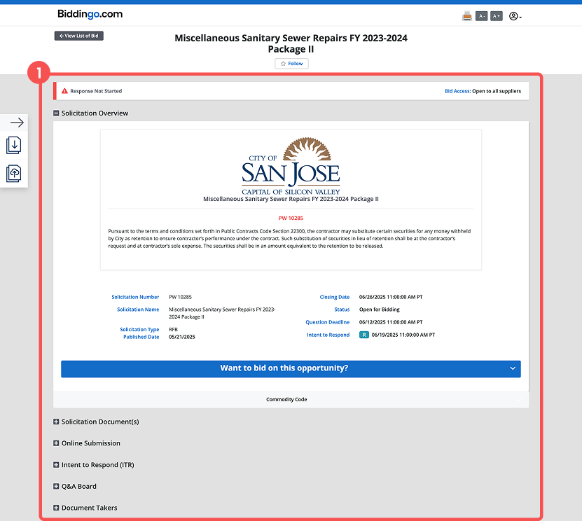
I redesigned the experience to expose key portions of bid information without requiring signup, making the platform more approachable. When a buyer publishes a bid as “Open to Public,” we now fully reveal the bid details, encouraging users to freely browse and engage.
Access to the most critical information such as the bid documents is gated behind a payment, creating a natural user flow from curiosity to conversion.
Success matrix 1: Increase overall conversion rate by approx. 10%.

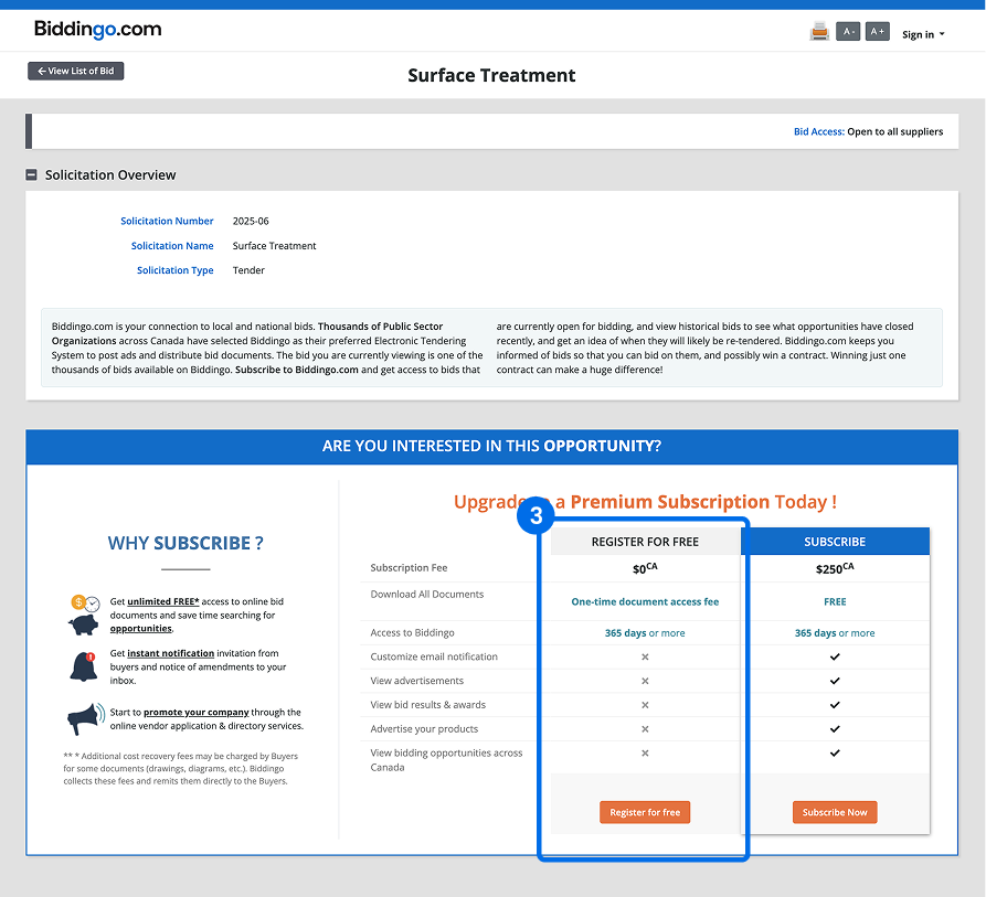
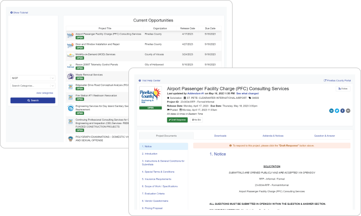
After removing the 30-day trial plan, I introduced a free registered account with limited access to expand exploration opportunities. However, users returning to the bid detail page after submitting a bid often lost direction.
They went back to the listing and searched again, but the experience felt repetitive. The lack of continuity forced them to restart the search process by re-entering keywords and filters.
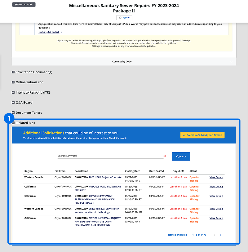
To address this, I aimed to create a continuous user experience. Based on the user flow analysis, the second abandonment point(transitioning from bid detail to subscription) still showed a low engagement rate(68%).
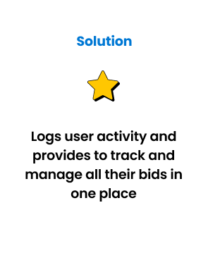
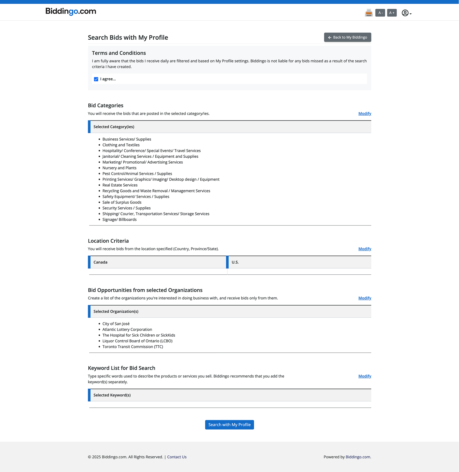
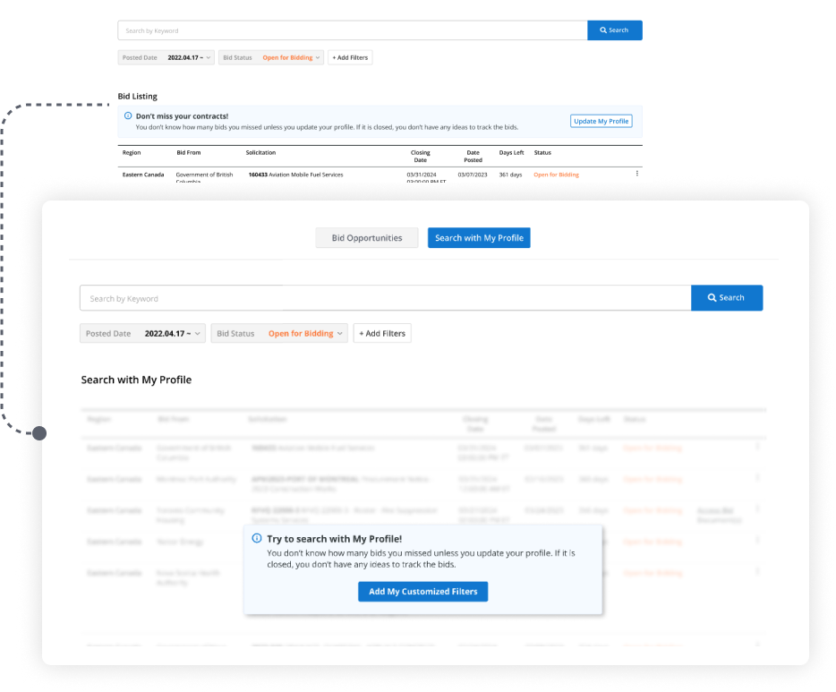
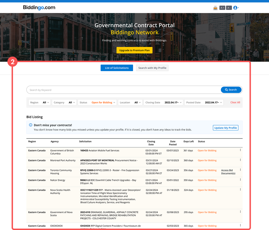
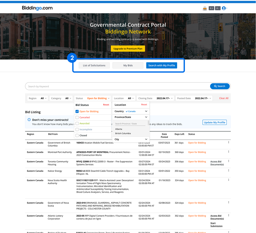
I improved this by introducing a Related Bids section on the detail page to spark curiosity and guide users forward. Additionally, we added a “Search with My Profile” feature to the main tab, allowing users to see bids automatically filtered by their saved profile preferences.
Success matrix 2: Increase the number of active users or engagement rate by 10% or increase the number of page views per active user by 5%.

Exceeding OKR Targets
Our primary objective was a 10% growth in conversion rate YoY. My work helped achieve a 53.44% increase in 2023 and an additional 14.03% in 2024, surpassing our OKR by over five times. This sharp growth aligned directly with the launch and optimization of user flows I designed.
KPI Improvements Across the Board
To boost engagement, I simplified the bid listing process, leading to a 12.51% rise in engaged sessions and a 25.45% increase in active users. The redesign reversed previous declines and restored user confidence.
Search Page Redesign: Key Driver of Engagement
I led the search experience redesign, resulting in a 25.81% increase in usage and a 19.16% boost in user engagement. The improvements reflect strategic, research-driven design that simplified complexity and rebuilt user trust.